Coin Metrics' State of the Network: Issue 3

Intro and Updates
Dear crypto data enthusiasts,
Welcome back to this week’s edition of Coin Metrics’ State of the Network, an unbiased, focused view of the crypto market informed by our own network (on-chain) and aggregate market data.
Last week was busy for Coin Metrics:
We released version 4.0 of our CM Network Data Pro product. Here is the summary blog post.
The Bletchley Indexes acquisition was announced and will be rebranded as the Coin Metrics Bletchley Indexes (CMBI). We’ve added a section to this newsletter covering CMBI.
The Coin Metrics API v2.0 will be promoted to “stable” on Tuesday, June 18th, resulting in breaking changes. Read the transition details here.
As always, if you have any feedback or requests, don’t hesitate to reach out at info@coinmetrics.io.
Weekly Feature
Comparing exchange volume to on-chain deposits
In pursuit of our objective to characterize the economic nature of all major public blockchains, we have sought to understand the centrality of exchanges. Some serve as de-facto banks while others allow traders to get exposure to the long tail of cryptoassets. Exchanges have a colossal on-chain footprint, and we would be remiss if we excluded them from our analysis.
Exchanges are often black boxes—much of the time, you have to take them at their word and trust that the market data they produce has integrity. However, we do have some fundamental audit mechanisms to gut-check their claims, with the most prominent being on-chain data. With some detective work, their wallet clusters can be found and analyzed.
We began work on this project several months ago and now feel confident enough in the integrity of the data to share some insights. As this data proliferates, we believe that analyzing exchange deposits will become a standard piece of trader diligence. It’s important to caveat that deposit data for exchanges is likely to be imperfect, and we are constantly improving our coverage. Check out our release blog post for more information about on-chain exchange flows. Eventually, we plan to work directly with exchanges so they can disclose this data on their own terms and we can be certain of its accuracy. If you’re an exchange and want to discuss, please reach out at info@coinmetrics.io.
Comparing trading volume and reserves allows us to derive some critical insights, which we will share with you over the coming weeks. First, it serves as a basic sanity check. An exchange with few demonstrable on-chain deposits but an extremely high claimed trading volume should be held in suspicion. For exchanges within the normal range, the ratio of exchange volume to reserves gives you an idea of the turnover within that exchange and its vibrancy as a market. Lastly, for derivatives exchanges, the relationship between the collateral deposited on the exchange and the trading volume or open interest could give you an idea of the average leverage ratio among traders.
The below chart shows the BTC reserves held at Bitfinex as well as the daily volume (in BTC terms) for all trades with BTC as the quote OR base currency (this would therefore include BTCUSD and XRPBTC). The intuition here is to capture all trading activity relating to Bitcoin at the exchange.

You can see that outflows from Bitfinex began in earnest in fall 2018 when news of a pending criminal investigation began to trickle out; and they accelerated in late April when the NY Attorney General filed suit against the exchange. Peak to trough, over 100k Bitcoins were withdrawn from the exchange.
As far as exchange vibrancy goes, Bitfinex is an active venue. In the last year, daily trades with BTC as the base or quote currency have averaged 15% of the value of BTC reserves held on the exchange. In late 2017, turnover was astronomical, peaking at 95% of the value of reserves.

The data for Poloniex, by contrast, tells a story of a venue in decline. Here we’re focusing on ETH trades and reserves since Poloniex was at one time a very popular exchange for ETH pairs.

In early 2016, Poloniex held over 11 million ETH in its vaults, down to only 1.1 million ETH today. Trading activity has also declined, not only on an absolute basis, but also relative to reserves. This means that the average trader with an ETH balance on Poloniex is trading in lesser volume today than they were 18 months ago.

In 2017, Poloniex’ volume-deposit ratio for Ether—the ratio of the volume of trades with ETH as the base or quote ticker to deposits on the exchange—averaged 11%. In 2019 so far, this ratio has averaged just 1.7%. Not only have traders moved on, but those that remain are trading less and less.
Binance by contrast tells a story of eye-popping growth, both in its BTC and ETH markets.


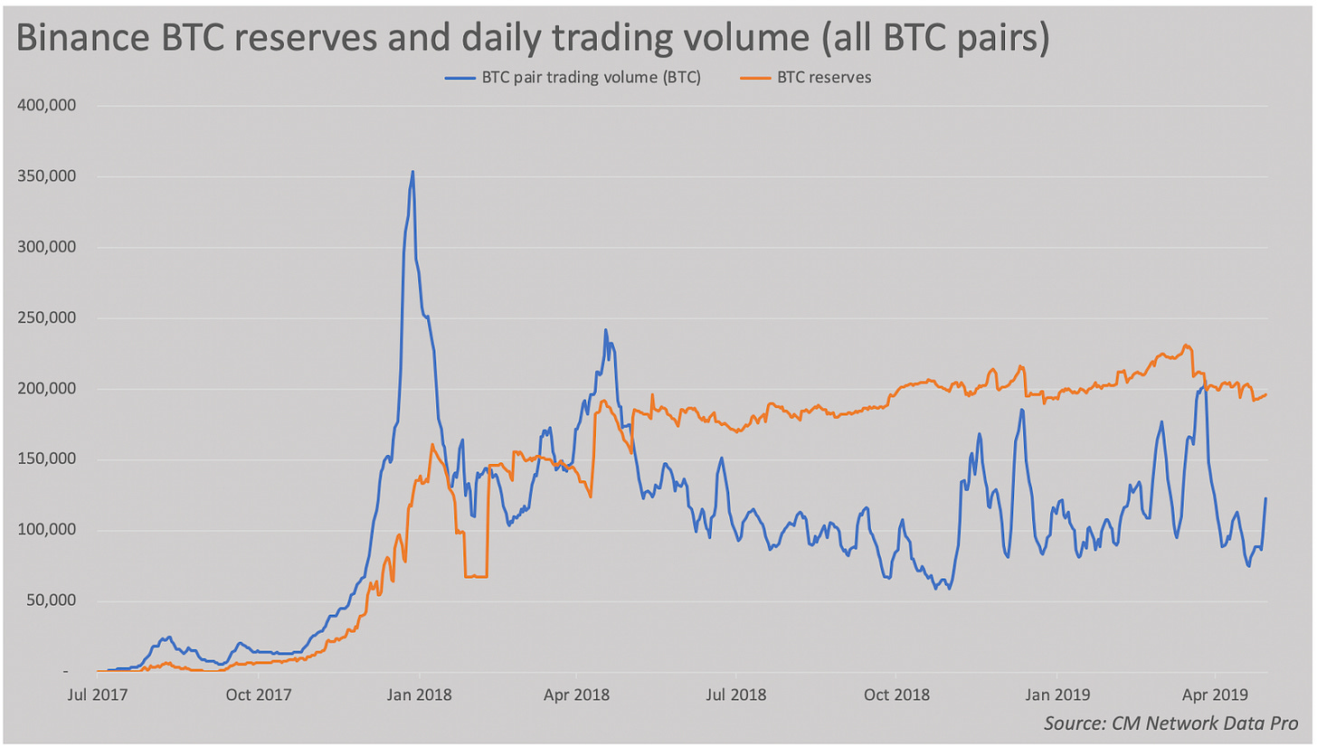
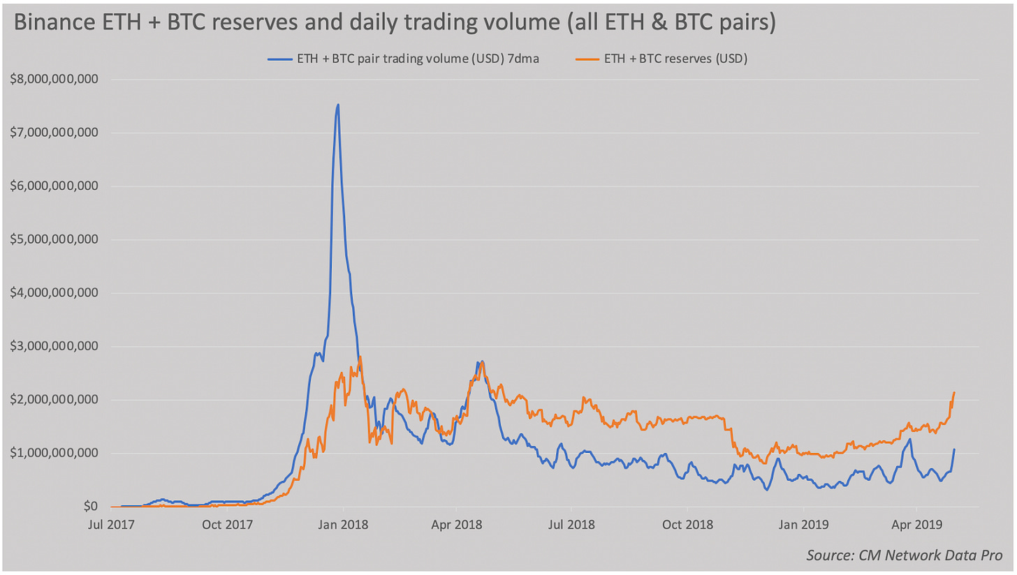
Since Binance straddles both chains, we’ve aggregated BTC and ETH deposits and trading volume in dollar terms in the chart below.

Relative to its reserves, Binance has staggering volumes. In the last year, it has averaged daily volume equivalent to an astonishing 51% of deposits. That means that trades against ETH or BTC pairs would match the deposits held on exchanges every two days. This may be partly due to the fact that Binance has far more markets featuring BTC or ETH than the other exchanges profiled here. But the figures nevertheless point to an exchange with extreme turnover relative to deposits held.

Note that the Y axis on this chart goes to 4, unlike the other volume-deposit ratio charts, because Binance has such elevated volume. In late 2017, Binance had daily volume in BTC or ETH pairs equivalent to four times the funds held on deposit. The difference between exchanges can also be due to usage characteristics. Some exchanges function more as trading venues, while others are used for long term storage. We expect that exchanges used as custodians and depository institutions would have a lower volume-deposits ratio.
The ultimate takeaway here is that the ledger is the ground truth, and as long as we can inspect it, we can hold exchanges accountable and equip traders and investors with the tools to protect themselves. At CM we believe sunlight is the best disinfectant, and while disclosing exchange reserves may be painful, it will be a powerful tool to sideline fraudulent entities and reward honest actors.
Network Data Insights
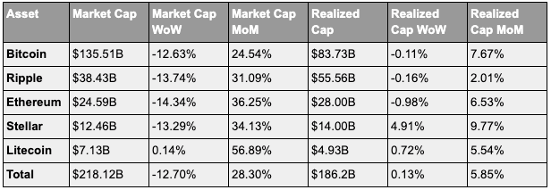
Summary Metrics

Mining Revenue

Network Highlights
Tether’s Growth on Ethereum
Tether (USDT) was launched on the Omni protocol but recently launched on Ethereum, Tron and EOS. On Ethereum, USDT’s ERC-20 is rapidly gaining on its Omni (BTC) counterpart both in terms of transactions and active addresses.
Here is a graph comparing USDT transaction counts across the different ledgers (note that “USDT” refers to the Omni ledger):

The below graph shows the head-to-head market share of transactions sent on USDT (Omni) vs USDT-ETH. On March 13th, USDT had close to 100% of usage. As of June 9th, 82.74% of all Tether transactions were sent on USDT, while 17.26% were sent on USDT-ETH.

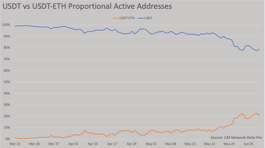
Similarly, USDT-ETH is starting to gain on USDT in terms of active addresses, which we define as ‘unique addresses that were active in the network that day:’

The head-to-head market share for active addresses is also starting to turn towards USDT-ETH. On June 9th, 20.9% of all Tether active addresses were on USDT-ETH, compared to only about 1% just three months earlier: :

Market Data Insights
Crypto asset prices continue to have no correlation to macroeconomic surprises
Bitcoin was created in January 2009 in the midst of and perhaps in response to a deep global recession caused by the financial crisis. U.S. equity prices would bottom just two months after bitcoin’s creation. Since then, all major developed world economies have enjoyed 10 years of moderate and coordinated economic growth, low inflation, and elevated asset prices with few exceptions.
Aside from the very first year of bitcoin’s existence, bitcoin has never existed during a global recessionary market environment leading many market participants to wonder how bitcoin would perform in such an environment. Although it is true that this empirical observational data does not exist and thus it is hard to definitively say how bitcoin would perform, recent market events over the past week provide us with additional clues to bitcoin’s sensitivity to the broader macroeconomic environment.
Two impactful macroeconomic events occurred this week:
One, in a conference sponsored by the Fed on June 4, Chairman Jerome Powell strongly signaled in a speech that the Fed is willing to enact stimulative monetary policy in response to any fallout caused by tariffs, trade wars, or other matters.
Two, on June 7, the U.S.’s employment situation released showing a large miss in both payrolls and wage growth relative to consensus expectations.
Both events were impactful in that they represented macroeconomic surprises—it contained new data with respect to expectations on growth, inflation, and the future path of monetary policy. All major asset classes reacted to the events—rising sharply in the case of U.S. equities.
BTC and other crypto assets, however, had no reaction to any of the events. There was no sharp change in price nor any increase in trading activity. The most recent empirical evidence indicates that crypto assets have little to no sensitivity to any macroeconomic surprises, including surprises to growth, inflation, and monetary policy. This implies that the amount of institutional capital deployed in the space is still in its infancy, existing institutional investors in the space do not react to macroeconomic surprises, and crypto assets will continue to remain uncorrelated to short-term surprises. The narrative that crypto assets respond favorably to increases in geopolitical risk, however, remains interesting and an open question.
BTC and ETH declined by 9% over the past week. Most major crypto assets sold off by a similar amount. The noteable outperformer is LTC which marked a 10% gain, perhaps because market participants continue to price in the impact of LTC’s block reward halving, scheduled to occur in less than two months.


Crypto assets exhibit high correlation in the short-run but high dispersion in returns in the long-run
Crypto asset prices continue to exhibit high correlation in returns over intraday time frames. The chart below shows BTC, ETH, and XRP’s indexed prices over the past week. The narrative that all crypto assets move together and that most assets follow BTC remains true when examining prices over this time frame.

The strong correlation over intraday time frames masks high dispersion of returns over longer time frames. Looking at returns over the past year paints a markedly different picture. Among major assets, only a handful have a positive return and the range between the best performing assets and worst performing assets is large.
Noteable assets include BNB with a +115% return over the past year, and BAT with a +39% return. On the other hand, ONT, NEO, XTZ, VET, and MIOTA have each lost more than 70% of their value over the same time span.


CM Bletchley Indexes (CMBI) Insights
June Rebalance
Consistent with the methodology, the CMBI products executed their monthly rebalance on June 1st. Read the June Rebalance Summary for more information.

MTD Metrics
As of June 1, 2019

Subscribe and Past Issues
If you'd like to get State of the Network in your inbox, please subscribe here. You can see previous issues of State of the Network here.
Check out the Coin Metrics Blog for more in depth research and analysis.


