Coin Metrics' State of the Network: Issue 109
Tuesday, June 29th, 2021
Get the best data-driven crypto insights and analysis every week:
And check out our new market-data focused weekly newsletter State of the Market.
Using On-Chain Indicators To Assess The Current Market Cycle
By Nate Maddrey and the Coin Metrics Team
The crypto markets dropped again this past week after more news of Chinese regulation, including the PBOC telling the country’s major financial institutions to stop facilitating cryptocurrency transactions, and a Huobi derivatives ban. The markets have now been in decline for almost seven weeks following the start of the crash on May 12th.
Before this year’s run crypto went through two major bull cycles, first in 2013, then again in 2017. Patterns have emerged over the years, and looking back at historical data can give some insights into current market conditions.
It’s important to note that each cycle is ultimately unique. Given the small sample size, it’s impossible to make predictions about exactly where we go from here. History does not repeat itself, but it often rhymes.
Every four years, Bitcoin’s supply issuance decreases by 50%. There have been three of these halvings to date, with the most recent on May 11th, 2020. Each halving has effectively signaled the start of a new cycle, with the 2013 cycle peaking 370 days after the first halving, and the 2017 cycle peaking 524 days after the second halving. We’re currently 413 days after the third halving.
On-chain data has historically helped shed light on these market cycles. Using past data, market value to realized value (MVRV) has been one of the most reliable on-chain indicators of bitcoin market tops and bottoms.
MVRV is calculated by dividing bitcoin’s market capitalization by its realized capitalization. In our variant of the MVRV calculation, we use free float market capitalization in place of the traditional version of market capitalization which is based on total on-chain supply. For a detailed explanation of MVRV, see our Bitcoin On-chain Indicators Primer.
Historically, MVRV has dropped below 1 between each cycle. The 2013 cycle had a double peak, with an initial peak of $230 in April, 9th 2013, and a second peak of $1,134 on December 4th, 2013. Price dropped as low as $66 between the two peaks. But after the first 2013 peak MVRV dropped below 2, but never reached 1.0. After the second 2013 peak MVRV dropped below 1 for the first time on September 28th, 2014.
In 2017, BTC peaked at $19,640 on December 16th. After the 2017 run it dropped below 1 for the first time on June 13th, 2018.
The current free float MVRV is 1.38. It hasn’t yet dipped below 1 following the crash in May, although it has been trending in that direction. But even if it does drop below 1, there’s a silver lining: the times MVRV have dropped below 1 have historically been the best opportunities to accumulate BTC.
Source: Coin Metrics Network Data Charts
Spent Output Profit Ratio (SOPR) gives another vantage point into bitcoin market cycles. SOPR is a ratio of bitcoin’s price at the time UTXOs are spent to its price at the time they were created. It acts as a proxy for gauging whether holders are selling at a profit or at a loss. A SOPR below 1 indicates that investors are selling at a loss, while above 1 indicates they’re taking profits.
SOPR (30-day average) dropped below 1 on June 5th, indicating that some investors are capitulating and selling at a loss. Historically SOPR dropped below 1 between each past cycle, but it also briefly dropped below 1 between the two 2013 peaks. There have also been some black swan events where SOPR has temporarily dropped below 1, like the March 2020 crash following the onset of the pandemic.
Source: Coin Metrics Network Data Pro
Bitcoin (BTC) age distribution bands, also known as “HODL waves,” show BTC’s supply grouped by the time since it was last moved on-chain. HODL waves give a macro view of how BTC’s supply has shifted over the years, which can be used as an indicator of market cycles.
Reading from the bottom of the chart up, the red colored bands show the percent of supply that has been active relatively recently, ranging from held for less than a day to 90-180 days. For example, the “1-7 Days” band is the percent of total supply that’s been held for at least 1 day but less than 7 days, “7-30 Days” is the percent of supply that’s been held for at least 7 days but less than 30 days, and so on.
Historically, short-term supply movement has peaked during market cycle tops. For example, in December 2017, over 32% of BTC supply had moved on-chain within the previous 90 days as the price of bitcoin neared $20,000. By August 2018, the proportion of supply moved within 90 days had dropped to about 15%.
Conversely, reading from the top of the chart down shows the supply that has not moved for relatively long periods. These long-term bands tend to grow wider as prices reach cycle lows and contract during cycle tops as long-terms holders begin to sell. The dark green band at the top represents coins that have never been moved on-chain apart from the transaction in which they were issued, constituting about 12% of the total supply.
During the 2013 and 2017 bull runs, the percent of short-term held supply (held for 180 days or less) reached about 50% which coincided with market tops. Periods where long-term held supply has reached over 60% have typically been good times to buy.
But during this run, the supply of BTC held for 180 days or less peaked at about 38% on April 30th. This could be an indication that there are more long-term holders this time around, and that the price action has been more short-term driven. But it could also potentially indicate that the cycle hasn’t yet reached its peak.
Source: Coin Metrics Network Data Pro
To follow the data used in this piece and explore our other on-chain metrics check out our free charting tool, formula builder, correlation tool, and mobile apps. And for more details on all of the charts and indicators in this piece see the Coin Metrics On-chain Indicators Primer
Network Data Insights
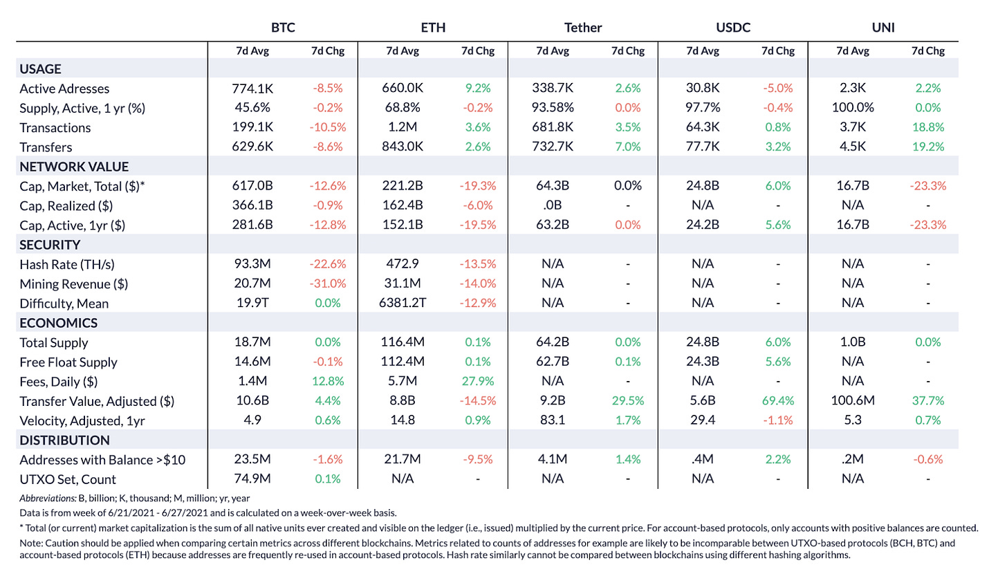
Summary Metrics
Source: Coin Metrics Network Data Pro
BTC and ETH market cap both fell again this past week, dropping by 12.6% and 19.3% week-over-week, respectively. But despite the smaller market cap drop, BTC usage dropped more than ETH usage. BTC active addresses dropped 8.5% week-over-week, while ETH active addresses increased by 9.2%. ETH daily active addresses topped BTC active addresses on June 27th, as seen in the below chart.
Stablecoin activity also continued to increase, with Tether (USDT) on-chain transfer value growing by 29.5%, and USDC transfer value increasing by 69.4%.
Network Highlights
ETH had about 200K more daily active addresses than BTC on Sunday, June 27th. This was only the third day since January 1st, 2017 that ETH has had more active addresses than BTC. The other two times that ETH topped BTC were June 5th and 6th, 2021.
Source: Coin Metrics Network Data Charts
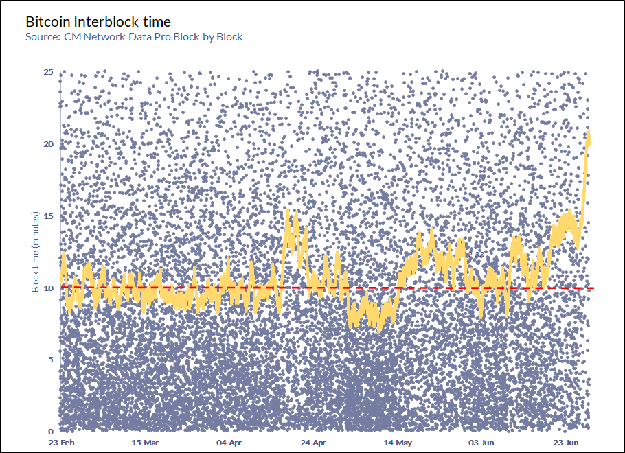
The average time between Bitcoin blocks reached about 23 minutes on June 27th (more than double the target block time of 10 minutes), its highest level in over 10 years.


Source: Galaxy Digital Research
There’s natural variance in block times - Bitcoin blocks are designed to be mined every ten minutes on average but it’s just a target, not a guarantee. In reality the time between blocks fluctuates above and below ten minutes and differs from block to block, and it’s possible that the spike was due this natural fluctuation. But there’s also a possibility that the large increase in average block time is more evidence that Chinese miners are temporarily shutting down their operations and migrating en masse.
Following recent crackdowns from the Chinese government, Chinese miners have been actively moving and searching for other locations abroad to set their operations back up. Although hash rate has been dropping in the short-term, it should bounce back once miners start to power back up in their new locations. Over the long-term this mass migration will help Bitcoin hash rate get further distributed around the world, and remove the previous concentration in China.
Source: Coin Metrics Network Data Pro
As of Monday afternoon, the average block time had dropped back down below 20 minutes. Although still abnormally high, it appears to be trending back towards normal levels. Despite the relatively extreme conditions, the Bitcoin network was designed to be able to withstand these types of sudden changes in hash rate. Following Bitcoin’s next difficulty adjustment in about 5 days block times should return back to around 10 minutes.
Source: Coin Metrics Network Data Pro
Coin Metrics Updates
This week’s updates from the Coin Metrics team:
Next week’s State of the Network will be published on Wednesday, July 7th due to the U.S. July 4th holiday observed on Monday. The following week, State of the Network will return to its normal publication time of Tuesday at 8AM EDT.
Check out our new market-data focused newsletter State of the Market, featuring weekly updates on market conditions.
We’re excited to announce the new Coin Metrics mobile app. View real-time cryptoasset pricing and relevant on-chain data in a single app! Download for free here: https://coinmetrics.io/mobile-app/
As always, if you have any feedback or requests please let us know here.
Subscribe and Past Issues
Coin Metrics’ State of the Network, is an unbiased, weekly view of the crypto market informed by our own network (on-chain) and market data.
If you'd like to get State of the Network in your inbox, please subscribe here. You can see previous issues of State of the Network here.
Check out the Coin Metrics Blog for more in depth research and analysis.


