Coin Metrics' State of the Network: Issue 97
Tuesday, April 6th, 2021
Get the best data-driven crypto insights and analysis every week:
And check out our new market-data focused weekly newsletter State of the Market.
Weekly Research Focus
Bitcoin On-Chain Indicators Update
By Nate Maddrey and the Coin Metrics Team
Disclaimer: Market analysis with on-chain indicators is a relatively nascent field and indicators are still being developed and refined. It's Important to note that past success does not guarantee future success; although these indicators have historically been informative, it does not necessarily mean this will always be the case. The green and red indicator zones on each chart are based off of past performance, but are not an exact science. This article does not constitute investment advice - please conduct your own research and view these metrics as one piece in the larger picture.
In December 2020 we released the Bitcoin On-chain Indicators Primer, an in-depth introduction on how to use on-chain data to help gauge crypto market cycles. A lot has happened since then, including several new all-time highs for both bitcoin (BTC) and ether (ETH). In this week’s State of the Network we update some of the charts featured in the report and look at how things have changed since the start of 2021.
Market Value to Realized Value (MVRV)
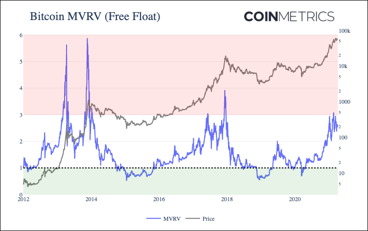
Market value to realized value (MVRV) has historically been one of the most reliable on-chain indicators of bitcoin market tops and bottoms. MVRV is calculated by dividing bitcoin’s market capitalization by its realized capitalization. Realized capitalization can also be thought of as a gross approximation of bitcoin’s aggregate cost basis. In our variant of the MVRV calculation, we use free float market capitalization which is calculated using liquid supply as opposed to total supply.
Historically, a high ratio of market capitalization to realized capitalization has signalled that bitcoin price was near a local maximum, while a low ratio has indicated that price is near a local minimum. The few times that MVRV has dropped below one have historically been some of the best times to buy bitcoin. An increasing MVRV indicates that current sentiment is increasing fast relative to estimated aggregate cost basis, while decreasing MVRV signals the opposite.
On January 8th, 2021 as BTC reached $40K for the first time, free float MVRV reached 2.96. This was a similar level to June 2017 when MVRV reached a high of 3.05. The following day BTC price began to decline, and dropped below $34K by January 12th.
MVRV topped 3.0 on February 20th for the first time since December 2017 and peaked at 3.09 on February 21st. This signalled another local peak, as BTC price reached about $57.5K on February 21st before falling to below $47K by February 28th. An MVRV of 3.0 has been a signal of local tops during the current market cycle (at least so far), as indicated by the red area in the below chart.
On March 13th MVRV approached 3.0 once again, increasing to 2.96 as BTC briefly topped $61K. It has since dropped down to 2.65 as of March 31st. It still has not reached levels seen at the top of the last two bull runs.
Source: Coin Metrics Network Data Pro
Spent Output Profit Ratio (SOPR)
Spent Output Profit Ratio (SOPR) gives another vantage point into bitcoin market cycles. Introduced by Renato Shirakashi in 2019, SOPR can act as a proxy for gauging whether holders are selling at a profit or at a loss.
SOPR is a ratio of bitcoin’s price at the time UTXOs are spent to its price at the time they were created. In other words, it’s a proxy for price sold divided by price paid. Every time a transaction occurs, we can compare bitcoin’s price at the time the UTXOs in that transaction were created to the price at which they were spent. Creating a ratio of the two gives a simple way to estimate whether the bitcoin in the UTXO was sold at a profit or loss.
SOPR can be computed for individual UTXOs, but it can also be computed for a group of UTXOs. The following chart shows the combined SOPR ratio of all UTXOs spent, aggregated on a daily basis. The metric is also smoothed with a 7-day rolling average as SOPR tends to be relatively volatile.
Historically, a high SOPR has signalled that bitcoin price is reaching a local maximum. Conversely, a low SOPR theoretically signals that holders are selling at a loss, which has historically indicated a good time to buy. A SOPR of 1 is also particularly important to watch, as it signals the tipping point from selling in profit to selling at a loss.
On January 8th, as BTC price topped $40K, BTC SOPR (7-day average) reached 1.048, its highest level since December 2017. The following day BTC price began to decline, and SOPR bottomed out at 1.004 on January 26th with BTC price at $32.6K. It has since rebounded to about 1.015.
Source: Coin Metrics Network Data Pro
HODL Waves
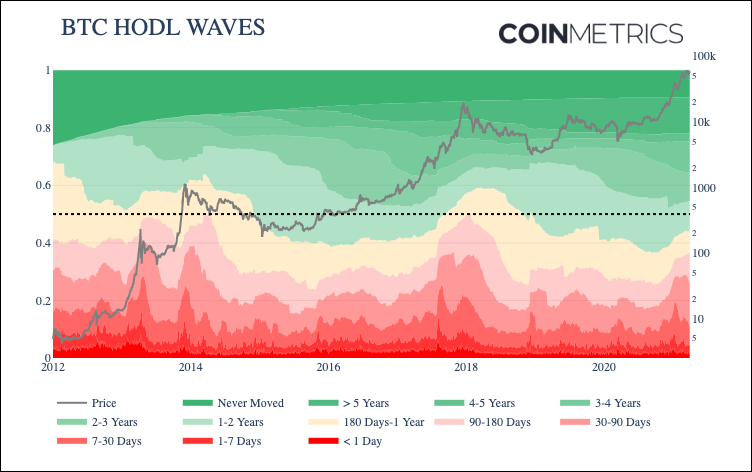
Bitcoin (BTC) age distribution bands, also known as “HODL waves,” show BTC’s supply grouped by the time since it was last moved on-chain. Introduced by Unchained Capital in 2018, HODL waves give a macro view of how BTC’s supply has shifted over the years. Bitcoin’s supply movements can be used as an indicator for market cycles.
Reading from the bottom of the chart up the red colored bands show the percent of supply that has been active relatively recently, ranging from less than a day to 90-180 days. The “1-7 Days” band is the percent of total supply that’s been held for at least 1 day but less than 7 days, “7-30 Days” is the percent of supply that’s been held for at least 7 days but less than 30 days, and so on.
Historically, short-term supply movement has peaked during market cycle tops. For example, in December 2017, over 32% of BTC supply had moved on-chain within the previous 90 days as the price of bitcoin neared $20,000. By August 2018, the proportion of supply moved within 90 days had dropped to about 15%.
Conversely, reading from the top of the chart down shows the supply that has not moved for relatively long periods. These long-term bands tend to grow wider as prices reach cycle lows and contract during cycle tops as long-terms holders begin to sell. The dark green band at the top represents coins that have never been moved on-chain apart from the transaction in which they were issued, constituting about 12% of the total supply.
During the 2013 and 2017 bull runs, the percent of short-term held supply (held for 180 days or less) reached about 50% which coincided with market tops. Periods where long-term held supply has reached over 60% have typically been good times to buy.
Short-term supply activity spiked on January 8th, with about 5% of supply active within the last 1-7 days. As of March 31 only about 36% of supply was active within the last 180 days, still well below the peak of about 50% during January 2018.
Source: Coin Metrics Network Data Pro
Full Report
Read the original full report here: the Bitcoin On-chain Indicators Primer.
And to explore our other on-chain metrics check out our free charting tool, formula builder, correlation tool, and mobile apps.
Network Data Insights
Summary Metrics
Source: Coin Metrics Network Data Pro
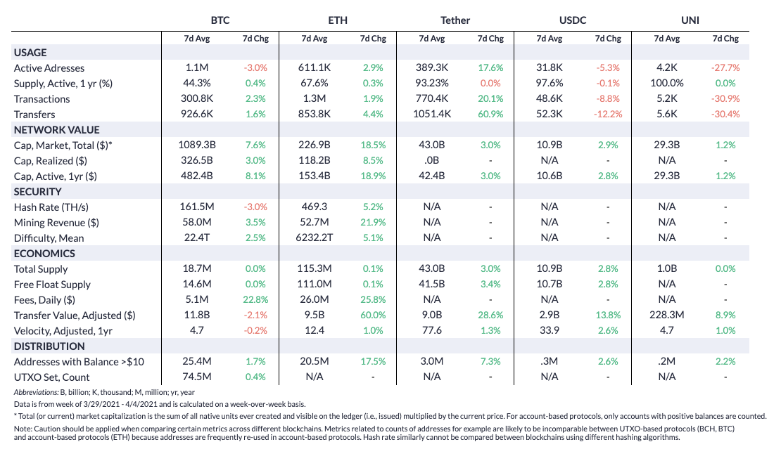
Ethereum on-chain activity surged this past week as ETH broke out to new all-time highs. ETH active addresses averaged 611.K per day over the last week, topping 600K for the first time since February. Transaction fees continued to climb, averaging $26M per day. And spurred on by the price and fees growth, Ethereum hash rate grew by 5.2% week-over-week and once again reached a new-all time high.
Bitcoin (BTC) also had a mostly positive week, with market capitalization and realized capitalization growing 7.6% and 3.0%, respectively. Fees grew by 22.8% week-over-week with an average of $5.1M a day. Hash rate dropped slightly on the week, but still remains near all-time highs.
Network Highlights
Ethereum’s on-chain transfer value, typically denominated in USD, has grown to new highs in 2021 as ETH price has climbed. Interestingly, the amount of value denominated in ETH has also surged. This differs from BTC, where the amount of on-chain transfer value denominated in BTC is significantly below 2017 highs.
Source: Coin Metrics Network Data Charts
Ethereum’s median transfer value denominated in ETH has surged since summer 2020, likely due to the rise of decentralized finance (DeFi). Bitcoin’s median transfer value denominated in BTC had dropped in 2021 as price has risen.
Source: Coin Metrics Network Data Charts
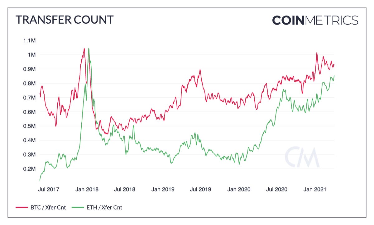
Since summer 2020 ETH has closed the gap in terms of daily transfer count compared to BTC. But BTC still averages about 926K daily transfers compared to about 854K for ETH.
Source: Coin Metrics Network Data Charts
The amount of ETH transferred by smart contracts has also risen dramatically since July 2020, again likely due to DeFi. With an average of 3-5M of ETH transferred by smart contracts per day, this accounts for a majority of the surge in ETH on-chain transfer value.
Source: Coin Metrics Network Data Charts
Coin Metrics Updates
This week’s updates from the Coin Metrics team:
Check out our new market-data focused newsletter State of the Market, featuring weekly updates on market conditions.
We’re excited to announce the new Coin Metrics mobile app. View real-time cryptoasset pricing and relevant on-chain data in a single app! Download for free here: https://coinmetrics.io/mobile-app/
As always, if you have any feedback or requests please let us know here.
Subscribe and Past Issues
Coin Metrics’ State of the Network, is an unbiased, weekly view of the crypto market informed by our own network (on-chain) and market data.
If you'd like to get State of the Network in your inbox, please subscribe here. You can see previous issues of State of the Network here.
Check out the Coin Metrics Blog for more in depth research and analysis.


