Analyzing Stablecoin Supply and Activity Distribution
By Antoine Le Calvez and the Coin Metrics Team
The following is an excerpt of “Analyzing Stablecoin Supply Activity and Distribution.” Reading the full article on the Coin Metrics blog.
Key Takeaways
The supply and activity distribution of a stablecoin can help us understand how it is used.
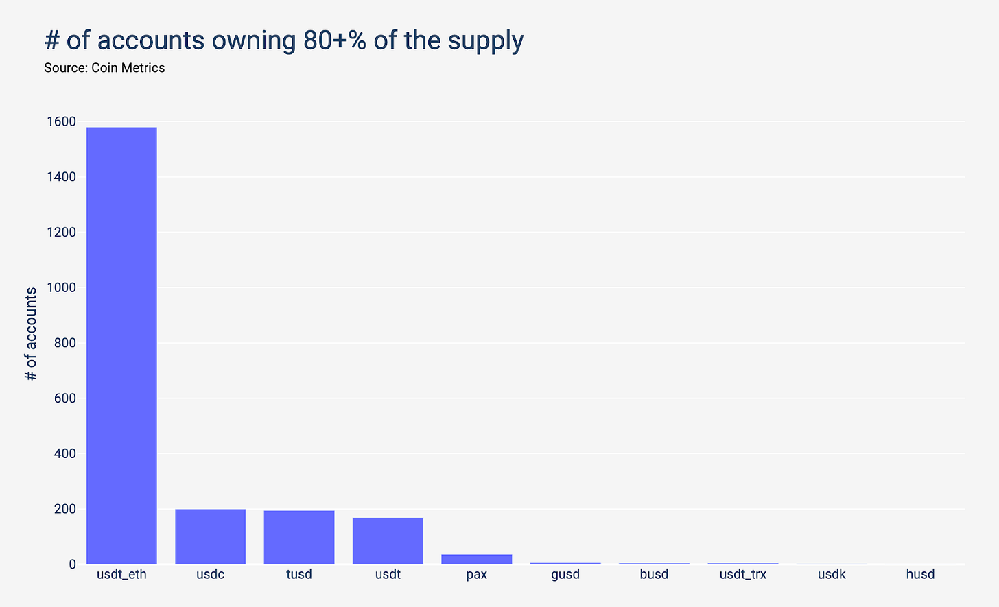
The ERC-20 variant of Tether shines as being particularly well distributed amongst its holders. Meanwhile, 6 accounts or less own 80+% of the supply for Gemini Dollar, Binance USD, Tether (Tron), USDK, and HUSD.
At first, Paxos appears to have a broad active user base. However, looking at the top transactors on Paxos leads to an interesting discovery: the two most active accounts on Paxos are linked to MMM BSC, a ponzi scheme which underwent an exponential growth in activity in the past year.
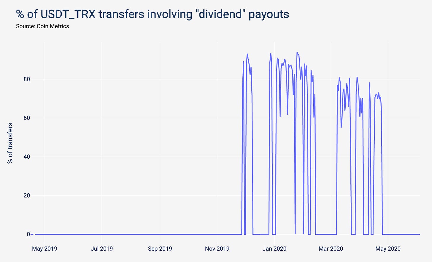
Another interesting discovery is that the most active Tether on Tron accounts are linked to “dividend” payouts. In some days, this was responsible for 90+% of Tether on Tron transfers.
Some stablecoins like Paxos and Tether on Tron see a lot of retail-like transactions, probably due to the presence of MMM and other dividend schemes on these assets. Other stablecoins like HUSD and Binance USD have a large share of payments above $100k.
Introduction
One of the biggest changes in the crypto industry over the past years has been the emergence and development of stablecoins. Split across many networks (Bitcoin, Ethereum, Tron and more) and issuers (Tether, Circle/Coinbase, Binance, etc.), these assets share many similarities: they have the same price, often use the same tech (ERC-20) and serve similar users.
In this piece, we will look at stablecoins network data and try to understand how their usage varies across the networks they are based on and their issuer. More particularly, we will look at Tether (on its Omni, Ethereum and Tron versions), Paxos, USDC, TrueUSD, Gemini Dollar, HUSD, Binance USD, and USDK.
Supply Distribution
The supply distribution of a stablecoin can help us understand how it is used. If it is only used on few exchanges without much other activity, most of the supply will be concentrated in few addresses. On the contrary, if it’s used by many exchanges and users, it will be more broadly distributed.

The ERC-20 variant of Tether shines as being particularly well distributed amongst its holders. Meanwhile, 6 accounts or less own 80+% of the supply for Gemini Dollar, Binance USD, Tether (Tron), USDK, and HUSD.
USDK has a particularly strange supply distribution. As of writing, 3355 accounts hold USDK, but 3170 (94%) only own either $0.5 or $1 which they received in July 2019 from an account who in turn got its money from OKex. Given that barely any recipient spent their money, it doesn’t look like a traditional airdrop.
Activity Distribution
Another way to compare stablecoins is to look at how many accounts are responsible for the majority of the on-chain activity (e.g. 80% of all on-chain activity, as in the chart below). If a small number of accounts are responsible for most of the transactions, it shows a lack of use outside of a handful of exchanges.

Note: For USDK, we exclude the activity related to crediting the 94% of accounts holding only $0.5 or $1.
At first, Paxos appears to have a broad active user base. However, looking at the top transactors on Paxos leads to an interesting discovery: the two most active accounts on Paxos are linked to MMM BSC, a ponzi scheme which underwent an exponential growth in activity in the past year.

Nowadays, more than 40% of all PAX transfers are directly related to this scheme.

Another interesting discovery is that the most active Tether on Tron accounts are linked to “dividend” payouts. In some days, this was responsible for 90+% of Tether on Tron transfers.

Continue Reading on the Coin Metrics Blog
Continue reading the full article on the Coin Metrics blog.
Network Data Insights
Summary Metrics

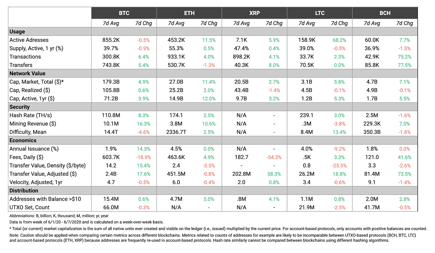
Ethereum continues to surge, with an 11% increase in both market cap and active addresses week-over-week. While Bitcoin’s market cap and realized cap also grew week-over-week, Ethereum once again led the way.
Ethereum is also closing the gap in terms of daily transaction fees. Ethereum averaged $463.6K daily transaction fees over the last week, compared to $603.7K for Bitcoin. Ethereum transaction fees rose towards the end of the week, and surpassed Bitcoin’s daily fees on both June 5th and 6th. We explore this trend more in today’s Network Highlights section.
Network Highlights
On June 5th Ethereum had more total daily transaction fees than Bitcoin. While Ethereum also topped Bitcoin in terms of daily fees on March 12th (due to network congestion after the price crash), Bitcoin has had more daily fees than Ethereum for most of its history.
After the recent halving, Bitcoin fees spiked to highs not seen since July, 2019. This rise in fees was mostly due to an increase in competition for block space, as explained in the Network Highlights section of State of the Network Issue 51.

But now Bitcoin fees appear to be dropping back to pre-halving levels. Bitcoin hash rate is recovering quickly following the halving, which means more blocks are being produced which leads to less block space congestion.
The following chart shows Bitcoin estimated hash rate, smoothed using a 7 day rolling average.

Simultaneously, Ethereum fees are spiking. This is at least in part due to the continued rise of Tether issued on Ethereum (USDT_ETH). USDT_ETH transfers surged to a new all-time high of 232.3K on June 6th.

In addition to hash rate, Bitcoin’s realized cap has recovered relatively quickly after the March 12th crash. Bitcoin’s realized cap reached $105.98B on June 6th and is approaching all-time highs. Bitcoin realized cap reached an all-time high of $106.26B in February 2020, before falling down to about $100B after March 12th.

Market Data Insights
To those following the digital asset space, few phrases can evoke as many feelings as “alt season.” Reading it here may stir up emotions of nostalgia, euphoria, greed and, of course, pain surrounding ‘the one that got away’.
To those unfamiliar, alt season is the portion of the crypto currency investing cycle where the altcoins (smaller cap digital assets which are neither Bitcoin or Ethereum) are in favor. There is no strict definition, but you know it once it arrives. Common informal indicators include tokens with < $50m market caps going on multiple day runs of double-digit returns. If you find yourself looking up tickers you read about in a forum, trying to predict the next Coinbase listing, or frustrated with how long it will take to transfer funds to an exchange listing your asset of choice, it might just be alt season.
In order to fully appreciate what happened in May, let’s put it in context with the trends in April. April 2020 was a very positive month for the Bitcoin investment narrative. We had Paul Tudor Jones telling the world that Bitcoin was a sensible trade to hedge inflation risk. CARES Act stimulus checks went out which Coinbase data suggested led to a greater amount of deposits on their platform. Personal savings rates increased to 33% from 12.7% in March, leaving Americans with a larger cushion of cash to be allocated to crypto. Enough speculation though, let’s look at the data.
Notable in the April changes are the increases in Spot Volume Market share of Coinbase, Kraken and Bittrex. These exchanges are the typical fiat on-ramps for retail investors.

In May, retail investors were feeling good. Bitcoin dip buyers aside, online stock brokers such as Robinhood, Fidelity, TD Ameritrade and E*Trade all reported record amounts of retail trader activity. This demographic of investors (read: speculators) who bought the dip on almost any heavily traded stocks benefited from a strong rally with the S&P 500 index gained 14% during the month of April.
A routinely studied trend in behavioral finance is that overconfident investors tend to move up the risk spectrum and take on more risk (one such study linked here). With this in mind, it is not surprising that we see the trend of trading volumes shifting from the fiat onramp exchanges to those servicing the long tail of riskier alt coins.

Similar to what we looked at for April, the above chart shows the change in spot market share for selected exchanges in May. Notably Coinbase and Kraken, the fiat exchanges with increases in April saw declining market share in May. However, exchanges such as Binance and Okex saw large increases. These exchanges with increasing market share support trading for a longer tail of assets, i.e. altcoins.
To verify this shift in volume to said assets we take a look at the change in spot trading market share by base asset.

The visual above shows an asset’s share of spot volume at the beginning and end of May, measured using a rolling 7 day average up to and including the relevant date. Notice that there is a break in the chart’s x-axis between 3.5% and 10%. This allows us to better understand the share of volume represented while still including BTC and ETH for context.
We can see that during the month of May, the volumes for BTC and ETH both decreased, roughly by 5% and 2% respectively. This share of volume shifted to assets such as ETC, OKb, Theta, OMG and MATIC. Trading volume has moved into these riskier assets sending a strong signal that alt season has arrived.
CM Bletchley Indexes (CMBI) Insights
All CMBI and Bletchley Indexes had another strong week, with the multi-asset indexes performing the best.
Both the CMBI Bitcoin Index and the CMBI Ethereum Index finished the week slightly up at 1.4% and 1.5% respectively. The Bletchley 20 (mid-cap assets) experienced the strongest returns, up 7.3% for the week, with the Bletchley 40 (small-cap assets) not far behind, returning 6.8%.

Coin Metrics Updates
This week’s updates from the Coin Metrics team:
Check out our special one-year anniversary issue to catch up on the best State of the Network articles over our first year.
Coin Metrics is hiring! Please check out our Careers page to view the openings.
As always, if you have any feedback or requests, don’t hesitate to reach out at info@coinmetrics.io.
Subscribe and Past Issues
Coin Metrics’ State of the Network, is an unbiased, weekly view of the crypto market informed by our own network (on-chain) and market data.
If you'd like to get State of the Network in your inbox, please subscribe here. You can see previous issues of State of the Network here.
Check out the Coin Metrics Blog for more in depth research and analysis.


