Coin Metrics' State of the Network: Issue 102
Tuesday, May 11th, 2021
Get the best data-driven crypto insights and analysis every week:
Coin Metrics is hiring! See open positions in Engineering, Research, and more.
Weekly Research Focus
The State of Bitcoin: Q2 Reset
By Nate Maddrey and the Coin Metrics Team
After a big Q1 bitcoin (BTC) has been relatively quiet so far in Q2, even as ether (ETH), Dogecoin (DOGE) and other cryptoassets have exploded.
In 2020 and early 2021 changing macroeconomic conditions helped fuel BTC’s rise and bring in a new wave of institutional investors. Now macroeconomic conditions could be shifting in BTC’s favor once again.
After strengthening during March, the U.S. dollar (DXY) weakened during April, and dipped again last week. Many investors are now expecting monetary easing to continue for longer than previously thought, as signs start to mount that the economy is still recovering. BTC has historically risen during times that the dollar has weakened, so this could be good news for BTC, at least in the short-term.
Source: Coin Metrics Network Data Charts
Furthermore, data suggests that the BTC market is in a healthier position than it was a few months ago. BTC perpetual futures open interest has reset to its lowest levels in months, which indicates that leverage has been flushed out of the system. This gives the BTC market a healthier foundation for the next leg up.
Source: Coin Metrics Market Data
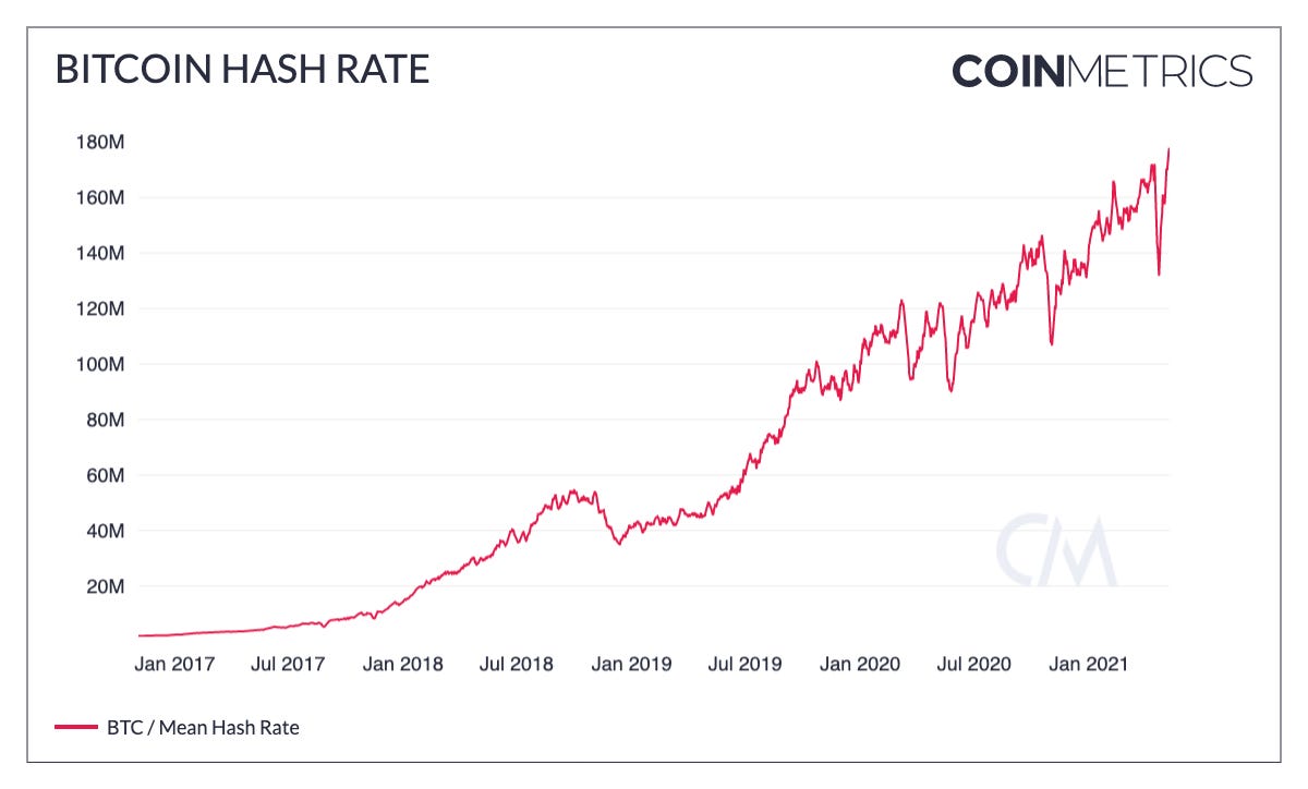
Bitcoin’s hash rate surged in early May to reach new all-time highs following a plummet in April after regional blackouts in China forced some mining operations offline. The drop spooked some investors into selling amidst fears of a potentially larger drop. But less than a month later hash rate has fully recovered and is back to higher levels than before the drop.
A proxy for network security, growing hash rate is a healthy sign for Bitcoin’s continued growth. Additionally, the rebound shows that the network is resilient and able to quickly recover after unexpected outages.
Source: Coin Metrics Network Data Charts
Although retail investors have been pouring into DOGE and other small-cap cryptoassets, BTC adoption has still been growing. The number of addresses holding relatively small amounts, between 0.01 and 1 BTC, has grown by 710K since the start of the year with a big surge in April. For context, in 2020 the number of addresses holding between 0.01 and 1 BTC increased by a total of 610K.
Source: Coin Metrics Network Data Charts
In another sign of growing adoption, on-chain transfer value surged in April to its highest levels ever. There was a total of $447B adjusted transfer value in April, compared to $366B in March and $319B in February.
Source: Coin Metrics Network Data Charts
Despite the relatively muted price action, the Bitcoin ecosystem has continued to expand in the background. On May 5th NYDIG announced that BTC will be coming to hundreds of US banks later this year. Bank customers are expected to be able to buy, sell, and hold BTC through their existing accounts, potentially bringing in many new investors. In another sign of growth, Square recently shared that BTC accounted for 15% of Cash App’s gross profit in Q1, up from 8% a year ago.
And Bitcoin technology is also in line for a major upgrade. Activation for Taproot has officially begun, as miners have begun to signal their support. Expected to go live later this year, Taproot will bring a lot of major improvements to how Bitcoin transactions work under the hood, including reduced fees and increased privacy. It will also lay the foundation for enhanced smart contract functionality and Lightning Network improvements.
With so much happening in crypto it can be easy to forget that Bitcoin is still growing at a rapid rate. Given the positive momentum on most fronts Bitcoin could be in for another surge during the second half of the year. To explore the data used in this piece and our other on-chain metrics check out our free charting tool, formula builder, correlation tool, and mobile apps.
Network Data Insights
Summary Metrics
Source: Coin Metrics Network Data Pro
Ethereum (ETH) continued to break through all-time highs this past week and on-chain metrics were up across the board as a result. Adjusted transfer value increased a huge 149% week-over-week for an average of $31.9B a day, over double BTC’s daily average of $14B. Fees are also back on the rise growing to $29.1M per day. And daily active addresses increased to over 803K, a 6.3% growth on the week.
Network Highlights
As part of our continued effort to make blockchain data easy to access for everyone we're happy to announce that we just released over 100 new network data metrics and indicators to our free community offering – more than doubling its breadth.
New community metrics include:
Greater granularity in our supply and address data, enabling the creation of wealth and HODL bands using our formula builder.
More market cap metrics, including Free Float and 1-year active market cap.
Indicators using Free Float supply including MVRV Free Float and Free Float NVT (90 day).
Many miner, fee and network usage metrics.
Aggregate exchange flow metrics.
Our supply distribution metrics (NDF and SER).
And many more….
Below we dive into some of the new metrics. And as always you can explore and download our community data using our free charting tool and formula builder.
BTC age distribution bands, also known as “HODL waves,” show BTC’s supply grouped by the time since it was last moved on-chain. HODL waves give a macro view of how BTC’s supply has shifted over the years.
Reading from the bottom of the chart up, the red colored bands show the percent of supply that has been active relatively recently, ranging from less than a day to 90-180 days. The “1-7 Days” band is the percent of total supply that’s been held for at least 1 day but less than 7 days, “7-30 Days” is the percent of supply that’s been held for at least 7 days but less than 30 days, etc.
Source: Coin Metrics Network Data Charts
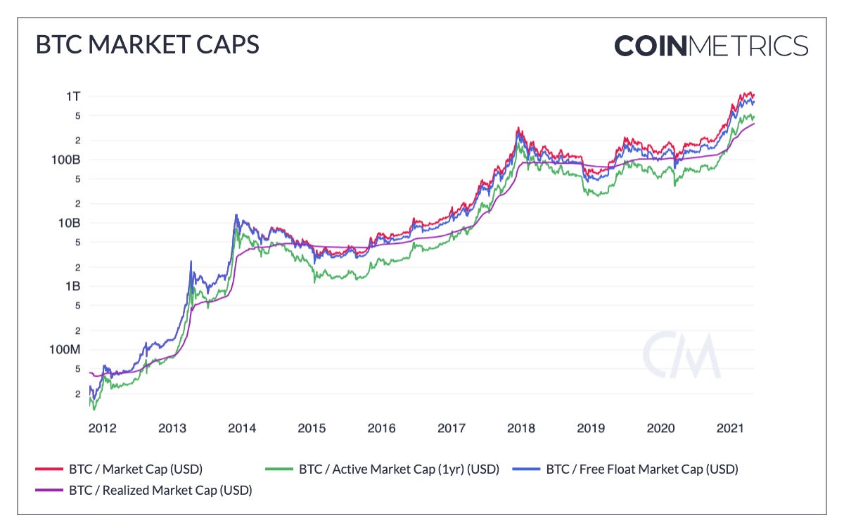
We also added several new versions of market capitalization in addition to traditional market cap. Realized capitalization was introduced in 2018 and gives a more long-term, slow moving measure of bitcoin’s total valuation. Realized capitalization is calculated by valuing each unit of bitcoin individually at the price that it was last transacted on-chain. Free float market cap calculates market cap using a more accurate measurement of the supply that’s liquid and freely available to the market.
Source: Coin Metrics Network Data Charts
The ratio of market cap to realized cap (MVRV) has historically been a relatively accurate indicator of local market cycles. We’ve now added free float MVRV to our community metrics, which adjusts MVRV to account for illiquid supply.
Source: Coin Metrics Network Data Charts
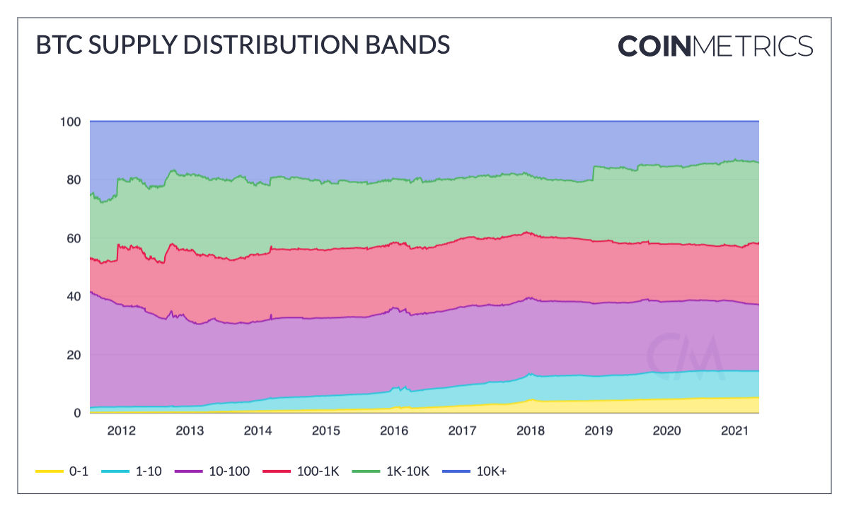
Lastly, we’ve added a suite of supply distribution metrics. The following chart shows the percent of total BTC supply held by different ranges of addresses. Reading from the bottom of the chart up, the first band shows the percent of total supply controlled by addresses holding between 0 and 1 BTC, the next band shows the supply controlled by addresses holding between 1 and 10 BTC, and so on.
Source: Coin Metrics Network Data Charts
Coin Metrics Updates
This week’s updates from the Coin Metrics team:
We’re excited to announce that we’ve raised $15 million in Series B financing led by Goldman Sachs. You can read more about the raise here, and words from our founder Nic Carter here.
Check out our new market-data focused newsletter State of the Market, featuring weekly updates on market conditions.
As always, if you have any feedback or requests please let us know here.
Subscribe and Past Issues
Coin Metrics’ State of the Network, is an unbiased, weekly view of the crypto market informed by our own network (on-chain) and market data.
If you'd like to get State of the Network in your inbox, please subscribe here. You can see previous issues of State of the Network here.
Check out the Coin Metrics Blog for more in depth research and analysis.


