Get the best data-driven crypto insights and analysis every week:
Weekly Feature
Investigating the Failed Stellar Inflation Experiment
By Antoine Le Calvez and the Coin Metrics Team
Each blockchain has a unique process for issuing new supply. For some, like Bitcoin, the full issuance schedule and final supply are encoded into the protocol (and is unlikely to change, due to social consensus).
Bitcoin issues new supply through block rewards issued to the miner of each block. Bitcoin block rewards halve on a predetermined schedule -- the next halving is expected to take place on May 11th, 2020. Other blockchains have issuance schedules that are not as resolutely encoded, and are subject to change. Ethereum issuance has been adjusted several times since 2017, most recently reducing the reward from 3 ETH per block to 2.
Whenever new supply is issued, monetary supply is inflated (we will therefore refer to this process as monetary inflation). This (at least theoretically) dilutes the value of the rest of the supply, unless an equal amount of existing supply is burned.
In the case of Bitcoin and Ethereum, the new supply is used to reward the protocol’s miners. But the new supply can also go to other destinations. Some blockchains, such as Stellar, reserve some of their newly issued supply for use by an official protocol-focused foundation. The Stellar Development Foundation (SDF), for example, is a non-profit organization that has a mandate to support the development and growth of the Stellar network.
From its genesis in 2014 until the activation of the version 12 of its protocol, the Stellar network featured a monetary inflation process that issued new units at a rate set to 1% per annum.
Here’s how it worked: each Stellar account could designate an “inflation destination” account that would get as many votes as lumens (XLM) the designating account held. Votes were tallied weekly and each inflation destination account that got voted by at least 0.05% of the supply would receive a share of the inflation pool proportional to the total balance of all its designating accounts, with any unallocated amount to be distributed during the next week. Any account could be designated as an inflation destination but only those that got voted by at least 0.05% of the supply would qualify to receive the new issuance.
In addition to newly minted units, transaction fees were also redistributed this way. However, they only account for a tiny amount of value compared to the inflation.
On September 30th, 2019 following a year of discussion within the community, the SDF announced that the monetary inflation process would be phased out. This protocol change was completed on October 28th 2019.
In this feature, we’ll look at the on-chain data to get to an understanding of the process, look at the reasons why it was phased out and finally, evaluate the impact it had on Stellar’s on-chain metrics.
Goals vs reality
In an email to the stellar-dev mailing list, Jeb McCaleb (co-founder of Stellar) listed 2 main reasons behind the existence of the inflation process:
A way to “address some criticisms of cryptocurrencies being deflationary”
To “give people incentive to collaborate and decide how network rewards are allocated”
Jed also elaborated that “any early inequities or problems with the initial distribution would get less important as time went on.”
Reality however proved different.
In a blog post announcing the deprecation of the inflation process, the SDF explained that the new supply, which should have helped “support the development and growth of the ecosystem,” was instead being claimed by individuals who were not actively working on development projects. This primarily happened through the creation of inflation pools, which allowed individuals to pool their resources together to pass the 0.05% supply threshold to qualify for receiving an inflation payout.
Inflation payouts overview
Over the roughly 4 years the inflation process was running (from October 2015 to October 2019), it was run 280 times and only 23 unique recipients got to share 5.482B XLM as the designated inflation destination accounts.
Astute observers will have noticed that the number of times the inflation process was run (280) is greater than the number of weeks that the process was running for (roughly 212 weeks).
From the Stellar protocol’s point-of-view, the inflation process didn’t start at the time the current public network was launched (Sept 30th 2015) but earlier, when the first public Stellar network was launched on July 1st 2014.
Participants
From the list of inflation recipients, we can identify several types of addresses using public sources:
Stellar Development Foundation (SDF) addresses
Exchange addresses
Inflation pool addresses
Unknown addresses (unknown large balance holders, etc..)
Inflation pools are a way for users to benefit from the inflation process if they own less than the qualifying amount to participate themselves (0.05% of the outstanding supply, roughly 50M XLM or $2.5M at current prices). Inflation pools users would designate the pool address as their inflation destination and get paid their due share weekly.
Exchanges started partaking in the inflation process too, with Binance and Poloniex even distributing the proceeds to their XLM balance holders.
In total, 1,087,306 accounts designated an inflation destination. This means that only 18.3% of the accounts ever created before the end of the inflation process participated in it. While this represents only a fraction of the accounts, it likely represented a large proportion of the supply since many of the largest accounts participated. Only a small minority (6.6%) of the accounts that designated an inflation destination voted for one that never passed the 0.05% threshold.
Looking at the payout recipients of the 2 largest inflation pools’ (Lumenaut and XLM Pool), we can see how many accounts participated in inflation pooling (and received payouts) as well as several key milestones: the end of the inflation process (late October 2019) and a change in policy from Lumenaut (in April 2019) which made it so they would only payout accounts holding at least 100 XLM.
This means that despite there being millions of Stellar accounts, only a few tens of thousands got to regularly enjoy the benefits of the inflation process (perhaps not surprising given that only 18.3% of accounts ever designated an inflation destination account).
Payouts flows
Putting it all together, we can paint a picture of how this newly minted money flowed:
As we can see, the great majority (98%) of the inflation payouts accrued to the SDF. This can be explained by two factors:
The SDF controls 80% of the supply and likely designated itself as an inflation destination
It has always participated in the inflation process
Given that Stellar became very popular in 2017, the SDF had a 2 year head start where it was nearly the only participant benefiting from the inflation process.
Furthermore, only a paltry amount of supply (834K XLM, $41K at current prices) went directly to community projects the way the inflation process intended it (it is unclear how the unknown destinations used their funds). Furthermore, since 98% of the newly created money went to the SDF despite it controlling 80% of the total supply, the inflation process arguably worsened inequities. For its part, the SDF has spent roughly 340M XLM (or $16.7M at current prices) from a total mandate of nearly 30B XLM since November of 2019 on development and growth.
Impact on network metrics
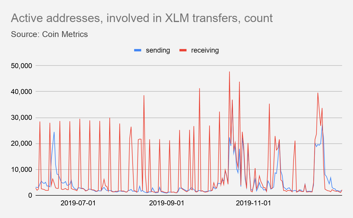
Looking at activity around Stellar’s native token (XLM), we can see the impact of the end of the inflation process:
The weekly spikes in addresses receiving XLM is now gone. These were caused by the inflation pools paying out their users. The Stellar inflation is therefore a good example as to why network data metrics have to be contextualized to take into account each network’s idiosyncrasies. Rather than measuring on a daily basis, Stellar active receiving addresses (the number of unique addresses that received XLM at least once in the observed week) could be measured instead on a weekly basis to smooth out the effect of this irregular issuance.
Doing so, we can see that it is now reaching lows unseen for months:
Aftermath
The SDF blog post announcing the end of the inflation process ended by mentioning that they would soon shed more clarity about their plans for handling their XLM, including the 5.4B XLM they received via the inflation process.
Indeed, a few days after the deactivation of the inflation process, the SDF burned 5B XLM from its operating fund and 50B XLM from its funds earmarked for giveaway, bringing the circulating supply to exactly 50B XLM, 20B of which is now outside the SDF control.
What we are left with is a few tens of millions of XLM having been doled out to exchanges and XLM owners over 5 years, with very little of it going to its intended use: helping community projects.
The Stellar inflation process was an interesting economics experiment. Analyzing it draws parallels with current hot topics like the Cantillon effect. It also helps in showing that each network has idiosyncrasies that have to be taken into account in order to better understand its activity and usage.
Network Data Insights
Summary Metrics
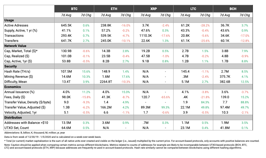
Ethereum (ETH) usage suffered a down week after completing its second hard fork in less than 30 days. ETH active addresses fell 16% week-over-week, and transfer count fell over 10%. Comparatively, BTC was marginally up in both active addresses and transfers, increasing 0.6% and 2.7%, respectively.
XRP, LTC, and BCH adjusted transfer value all increased by at least 50% from the previous week. BTC adjusted transfer value, however, went in the opposite direction, decreasing by 6.2%.
Network Highlights
The major stablecoins are off to a hot start in 2020. The following chart shows the weekly growth in the number of addresses with a balance of at least $10 for 18 large cryptoassets. The Ethereum version of Tether (USDT-ETH), Paxos (PAX), and USD Coin (USDC) all grew by at least 2.2% over the past week, while BTC and ETH grew 0.52% and 0.94%, respectively.
The number of addresses with a balance of at least $10 can be used as an approximate measure of the number of total “retail” holders of an asset. However, it’s important to note that one address does not necessarily mean one user (users often have multiple addresses), so it should be thought of as a maximum number of potential holders.
The number of stablecoin addresses with a balance of at least $1M has also been increasing over the past year. The following chart shows the annual growth for the same 18 cryptoassets. USDT-ETH, USDT Omni (USDT), and USDC all outpaced Bitcoin over the course of 2019.
Read more on this plus similar charts for 18 other metrics in our State of the Network 2019 Year in Review.
Market Data Insights
Despite the increase in prices over the weekend, most major cryptoassets are flat or down over the week with a few important exceptions. Both Bitcoin Cash (+5%) and Bitcoin Cash SV (+9%) saw outsized gains relative to the overall market.
Coins with privacy features including Monero (+15%), Dash (+14%), and ZCash (+5%) have performed well over the past week. Monero briefly entered the top 10 coins ranked by market capitalization at the tail end of the previous week. Ethereum Classic (+4%) continues its outperformance over the past month.
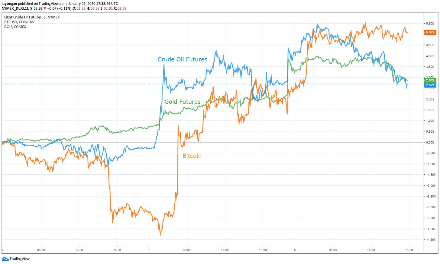
Bitcoin and the broader cryptoasset reaction function to macroeconomic and geopolitical events is still not understood. Over the past weekend, an event transpired which provides additional data to help us understand Bitcoin’s reaction function -- the United States led a drone strike that killed Iranian Major General Qasem Soleimani. Over the subsequent days, tensions between the United States and Iran have escalated as both countries consider their response.
The drone strike occurred at approximately 22:00 UTC time on January 2, 2020. News of the strike started to be published approximately three hours later at 01:00 UTC time on January 3, 2020. It was during this time that oil and gold futures had a sharp reaction -- oil likely due to market participants pricing in a higher probability of disruption in oil supplies in the Middle East and gold likely due to a standard flight-to-safety response in the face of geopolitical conflict.
Bitcoin did not immediately respond to the publication of the drone strike. A sharp increase did occur about three hours after the initial reports started coming in, suggesting either a delayed reaction or a spurious connection. Oil, gold, and Bitcoin are all markedly higher since the incident, adding some support that Bitcoin responds positively to such events. However, the difference in timing suggests that a spurious connection between Bitcoin and the event or limitations on the speed of information diffusal are still possible explanations. We previously examined the speed of information diffusal of cryptoasset markets using TRON in State of the Network Issue 10.
As the weekend progressed and the situation continued to escalate, oil and gold continued to rise with a large increase on the night of January 5, 2020. Again, Bitcoin saw a positive movement delayed approximately three hours.
CM Bletchley Indexes (CMBI) Insights
2019 was a story of two halves. After the bear market of 2018, the first half of 2019 saw much promise as cryptoassets, led by Bitcoin, all performed strongly. Large-cap assets were the best performers with the Bletchley 10 returning close to 200% leading up to July. However, after this rapid marketwide recovery, cryptoassets struggled to maintain these growth levels, and saw declines through the second half of the year. Many cryptoassets, including ETH, even returned to the levels where they started 2019.
Large-cap assets still finished the year relatively strong, but low-cap assets struggled particularly through Q3. This is evidenced by the Bletchley indexes with the Bletchley 10 returning 49%, the Bletchley 20 returning 17% and the Bletchley 40 returning -45%.

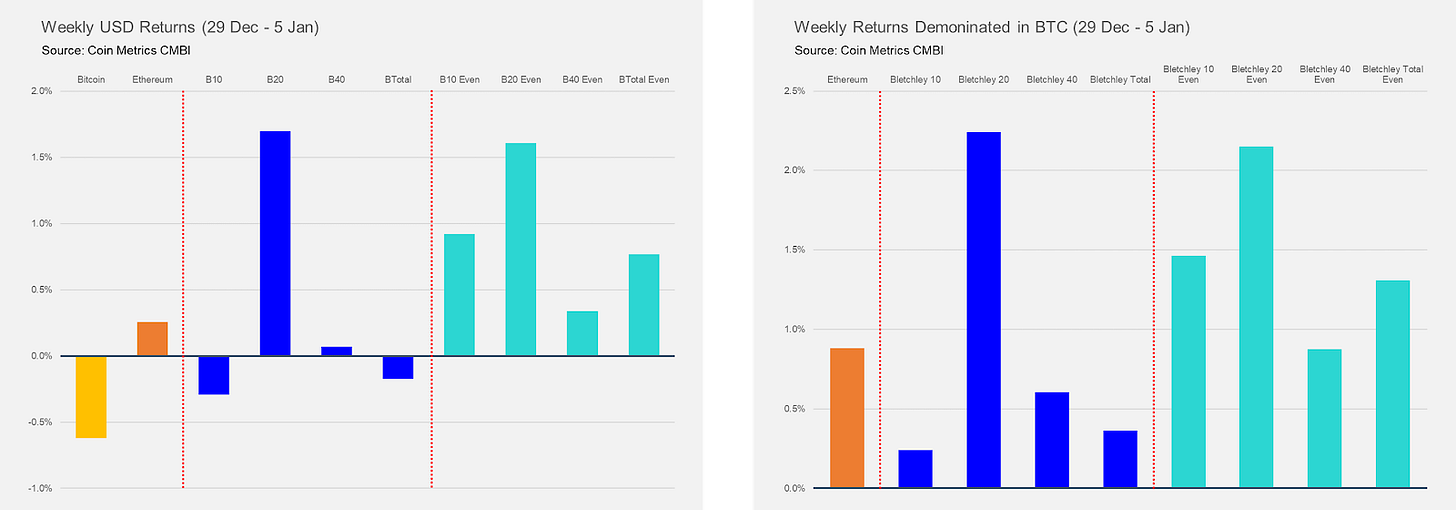
Cryptoassets started 2020 with a relatively quiet week as the Bletchley Indexes saw mixed returns. The Bletchley 20 performed best, returning 1.7%, with the Bletchley 10, Bletchley 40 and Bletchley Total all finishing the week relatively flat. It is interesting to observe that most of the even indexes outperformed the market cap weighted indexes this week, indicating that the larger-cap assets in each index underperformed the lower-cap assets in each index where this outperformance occurred.

Coin Metrics Updates
This week’s updates from the Coin Metrics team:
In case you missed it, check out our State of the Network 2019 Year in Review, over 30 pages of charts and analysis about the major cryptoassets’ performance in 2019.
Coin Metrics is hiring! We recently opened up 6 new roles, including Blockchain Data Engineer and Data Quality and Operations Lead. Please check out our Careers page to view the openings.
As always, if you have any feedback or requests, don’t hesitate to reach out at info@coinmetrics.io.
Subscribe and Past Issues
Coin Metrics’ State of the Network, is an unbiased, weekly view of the crypto market informed by our own network (on-chain) and market data.
If you'd like to get State of the Network in your inbox, please subscribe here. You can see previous issues of State of the Network here.
Check out the Coin Metrics Blog for more in depth research and analysis.


