State of the Network 2019 Year in Review
Wednesday, January 1st , 2020

By Nate Maddrey and the Coin Metrics Team
In this special edition of State of the Network (SOTN) we take a look back at how the major cryptoassets performed over 2019 across four categories:
Valuation
Usage and Adoption
Economics
Security and Health
We selected several metrics for each section and analyzed how 18 of the largest cryptoassets performed across those metrics. Each section includes charts which show the yearly change for a metric for each asset as well as a summary table with yearly averages from 01/01/2019 to 12/30/2019 (the valuation table shows end-of-day values for 12/30/2019 while all other tables show yearly averages).
Note: If you received this piece through email it might be truncated due to length. View on the website (https://coinmetrics.substack.com/) for the full piece.
Valuation

Table values are end-of-day values for 12/30/2019
Price, USD
Despite the downturn at the end of the year, most of the major cryptoassets actually finished significantly up on the year in terms of price.
Bitcoin (BTC) finished the year up 90% while Ether (ETH) finished down 6%. After Tezos (XTZ) was added to Coinbase and XTZ staking was released on Coinbase Pro and Binance, XTZ had a late surge to finish the year up a stunning 182%.
A few mid-cap assets also had a strong year, including Chainlink (LINK), up 513%, and Basic Attention Token (BAT), up 45%. XRP, Stellar (XLM), and Zcash (ZEC) on the other hand all finished in the red, down 47%, 60%, and 52% respectively.

Chart values are annual percent change (1/1/2019 - 12/30/2019) of the USD daily midnight UTC closing price (CM Reference Rates)
Market Capitalization
Market capitalization (market cap) is calculated by multiplying the current total supply by the current market price. For example, if BTC’s price today was $10,000, every coin would be valued equally at $10,000. This would result in a total market cap of $178,981,250,000 (17,898,125 total BTC multiplied by $10,000).
For the most part, yearly market cap changes align closely to price changes with one big exception: stablecoins.
It was a big year for Tether on Ethereum (USDT_ETH). As we covered in SOTN Issue 17, USDT_ETH rapidly overtook Tether on Omni (USDT) in market cap in 2019. USDT_ETH’s market cap grew by almost 3700% over the past year to a total of nearly $2.3B, while USDT Omni’s market cap fell by nearly 39% to a total of about $1.6B. Two other stablecoins, PAX and USDC, grew by 65% and 100%, respectively.
Note that we use total (or current) supply for our market cap calculations. This is supply inclusive of all funds held in treasury (or otherwise restricted) and visible on the ledger. This is in contrast to market cap calculations which use circulating supply which removes coins restricted from trading. Using total supply will yield larger market caps for assets such as XRP or XLM that have large tranches of restricted supply in treasuries.

Chart values are annual percent change (1/1/2019 - 12/30/2019) on a 1 day (1d) basis
Realized Cap
Unlike market cap, realized cap values each coin at the time it last moved (i.e., transferred between two distinct addresses) on-chain. So if a coin last moved in 2017 when the price of the asset was $2,500, that particular coin would be priced at $2,500 instead of the current market price. The sum of the prices of all coins priced this way gives the realized cap.
Realized cap can be thought of as a measure of the average cost basis of all holders of an asset. Read more about realized cap in SOTN Issue 14 and Issue 28.
Note that for assets for which founders hold large portions of supply in treasury, such as XRP, realized cap should be interpreted with caution. If founders move large portions of supply between treasury wallets at a time when prices differ significantly from the current price, it could result in large and unnatural moves in realized cap. Coin Metrics currently does not calculate realized cap for all assets covered in this issue; however, these will soon be available in the new year.
BTC’s realized cap increased by nearly 28% over the course of 2019. ETH’s realized cap, however, fell by 19%. The differences in market cap vs realized cap can be interpreted as a difference between market expectations and investor behavior. In BTC’s case where its market cap grew by 97% while its realized cap only grew by 28%, price increased more than the average cost basis, which signifies that most investors held onto their coins rather than realize their profits.

Chart values are annual percent change (1/1/2019 - 12/30/2019) on a 1d basis
Market Value to Realized Value (MVRV)
Market value to realized value (MVRV) is calculated by dividing the market cap by realized cap. A low MVRV is a potential signal that market participants are minimally in profit or not in profit (if MVRV is negative), while a high MVRV ratio may signal that asset holders are well in profit.
BTC MVRV increased over 2019 finishing at 1.33 indicating that BTC holders were increasingly in profit since the start of 2019 and remained in profit by the end of the year. ETH MVRV on the other hand grew modestly, signifying ETH holders were also increasingly in profit, but finished at 0.61 indicating that holders were collectively underwater at the end of the year. Bitcoin SV (BSV) MVRV dropped considerably over 2019 indicating that BSV holders were increasingly underwater, but still finished the year at 1.70, well into profit.
Note that a high MVRV doesn’t necessarily signify future expected price increases. In fact, the opposite may hold. When holders are increasingly highly in profit, they are increasingly more likely to sell, and this has held true historically (for example, an MVRV of more than 4 has coincided with all the major post-bull run price declines in Bitcoin history). Whether this will hold true going forward remains to be seen.

Chart values are daily (end-of-day) values (1/1/2019 - 12/30/2019)
Volatility, Daily Returns, 30d
The 30-day (30d) volatility is measured as the 30d standard deviation of log daily returns. Read more about our analysis of volatility in the Market Data Insights sections in SOTN Issue 22 and Issue 29.
Volatility decreased across the board in 2019, finishing the year at 2.6% for BTC and 3.3% for ETH. Although there are some positives to price stability, lowered volatility can reduce profits for traders and may incentivize traders towards increasing leverage.

Chart values are daily (end-of-day) values (1/1/2019 - 12/30/2019)
Usage and Adoption

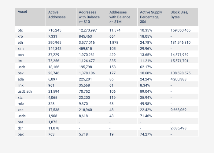
Table values are annual averages of daily values (1/1/2019 - 12/30/2019)
Active Addresses
One way to measure the number of potential blockchain users is to look at active addresses, which we define as the number of unique addresses active in the network that day, either as a recipient or originator of a ledger change (“ledger changes” include anything that changes a blockchain’s on-chain ledger, including transactions and other operations).
Active addresses can serve as a proxy for daily active users of the underlying blockchains. However, one active address does not necessarily equate to one active user. Individual users can create and operate as many addresses as they want. Therefore active addresses represent a maximum number of potential blockchain users, while the actual number of daily users is lower.
Active addresses increased for most of the major cryptoassets over 2019, a positive sign for overall crypto adoption. USDT_ETH, LINK, and XTZ saw the largest growth in 2019 while XRP, XLM, and ZEC saw decreasing activity over the course of the year with XLM decreasing by a whopping 66%. The XTZ active addresses line appears thicker than other assets because XTZ has staking payouts on a regular basis, which leads to high variance in activity day-to-day.
Note: ZEC active address metric and other usage metrics do not take into account shielded transactions.

Chart values are annual percent change (1/1/2019 - 12/30/2019) on a 7d moving average basis
Number of Addresses with Balance of At Least $10
The number of addresses with a balance of at least $10 can be used as an approximate measure of the number of total “retail” holders of an asset. $10 is a somewhat arbitrary number but is a small enough balance to be considered an average, non-institutional investor, and large enough to not be dust (amounts smaller than the fee required to move them).
However, the same caveat as with active addresses also applies here: one address does not necessarily mean one user, so it should be thought of as a maximum number of holders. Contract addresses or various exchange deposit addresses (of which there are many) would be included in these figures.
Similar to active addresses, the number of addresses with a balance of at least $10 also increased for most of the major cryptoassets over 2019, another positive sign for overall crypto adoption. All of the stablecoins in our sample increased considerably. Of the non-stablecoins, XTZ and LINK saw over 100% gains on the year. Only BSV, XRP, and ZEC saw decreases. BSV is particularly odd since it saw a large increase in active addresses of over 600%.
BTC and ETH both have significantly more addresses with a balance of at least $10 than all other major cryptoassets. ETH has nearly 2x as many as any other asset (besides BTC) and BTC has almost 4x as many as ETH.

Chart values are annual percent change (1/1/2019 - 12/30/2019) on a 7d moving average basis
Number of Addresses with Balance of At Least $1M
The number of addresses with a balance of at least $1M can be used as an approximate measure of the number of total “institutional” investors (or institutions), including exchanges, custodians, foundations, and others.
BTC has a large lead over every other asset in institutions or institutional investors (keep in mind it also has the largest market cap by a large margin). On average, BTC finished the year with over 11,000 addresses with a balance of at least $1M, while ETH finished with over 1,800. No other asset finished with more than 700. In terms of growth however, LINK and USDT_ETH led the way posting 538% and 5817% growth respectively.

Chart values are annual percent change (1/1/2019 - 12/30/2019) on a 7d moving average basis
Active Supply Percentage, 30 Days
Active supply percentage, 30 days measures the percent of total supply (visible on ledger) that was transacted at least once in the trailing 30 days. Coins transacted more than once are only counted once.
A decrease in active supply percentage may signal that an asset is being increasingly used as a store of value, while an increase could be a sign that an asset is being used more as a medium of exchange. However, these are just proxies. A decrease in active supply can also occur if an asset’s usage is generally declining. There are also other factors that could affect active supply, such as exchanges or foundation treasuries shuffling large amounts of supply between cold wallets that can result in large changes in activity.
Of the large cap assets, BTC decreased in percentage of supply active in the last 30 days from 14% to 9% while ETH decreased from 32% to 24%. In contrast, stablecoins showed large percentages of active supply ranging from 50-75% suggesting they are being used as intended, as mediums of exchange.

Chart values are daily (end-of-day) values on a 7d moving average basis
Block Size, Bytes
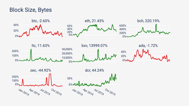
Block size, bytes measures the total sum (in bytes) of all blocks added to a blockchain that day. This metric is only possible to measure for the public blockchains and therefore does not apply to ERC-20 tokens or other tokens built on top of public blockchains.
Increasing block sizes could indicate that a blockchain is seeing more usage overall (as transaction counts increase, demand for block space increases) or is seeing increasing usage in “costlier” transactions (such as complex contract transactions that take up more block space). However, increased block size could also be caused by a small number of users spamming the chain (particularly on low-fee blockchains) so it is important to look at block size increases on a case-by-case basis and consider other contextual clues. It’s also worth noting that if blocks are already mostly full as they are for some blockchains such as Bitcoin and Ethereum, there may be little space for additional increase unless block size limits are increased.
Block size increased for most blockchains in our sample, meaning blockchains are becoming increasingly fuller as demand for block space increases. Notably, BSV block size increased by a huge amount: nearly 14,000%. This is likely because BSV is being used heavily for data storage, as opposed to monetary transactions (such as transfers of BSV coins), as we covered in SOTN Issue 8. BTC, ZEC, and Cardano (ADA) all saw decreases with ZEC seeing the largest at nearly 45%.

Chart values are annual percent change (1/1/2019 - 12/30/2019) on a 7d moving average basis
Economics

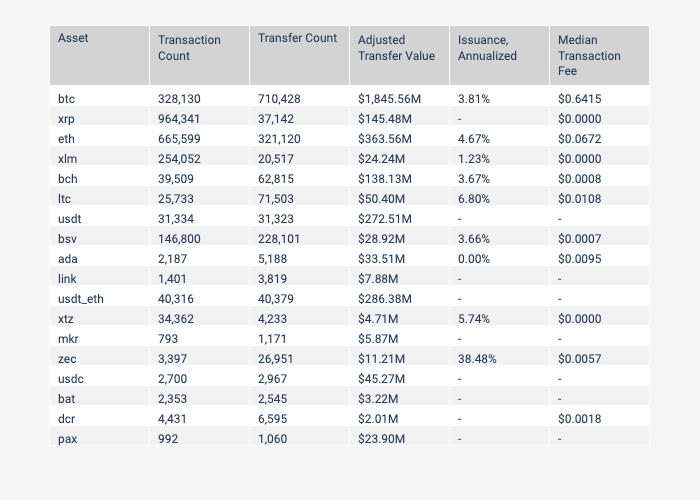
Table values are annual averages of daily values (1/1/2019 - 12/30/2019)
Transaction Count
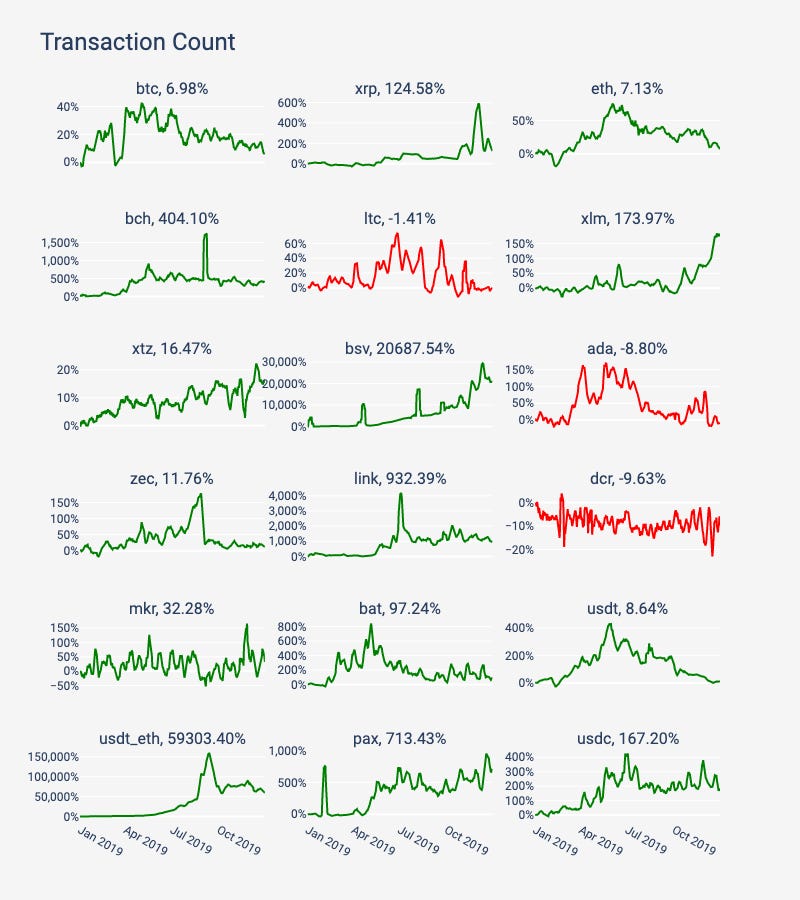
Transaction counts increased for most major assets over 2019. After USDT_ETH, which saw an incredible 59,303% increase, BSV saw the next largest increase in transaction counts (20,688%) with the majority (74%) being non-economic OP_RETURN transactions used to store data on-chain. Of the major assets, XRP, saw an average of nearly 1M transactions, largely due to a late surge towards the end of the year, as noted in SOTN Issue 28.

Chart values are annual percent change (1/1/2019 - 12/30/2019) on a 7d moving average basis
Transfer Count
Transfers are transactions that include an exchange of the native blockchain cryptoasset. In other words, a transfer is any transaction where a cryptoasset is moved from one address to another. For protocols like Ethereum, only transfers of ETH are counted, not ERC-20 or other tokens.
BTC and ETH led all assets in terms of annual average daily transfer count. BSV and USDT_ETH however saw the largest increases at 19,254% and 60,647%, respectively.
Note that the XTZ active addresses line appears thicker than other assets because XTZ has staking payouts on a regular basis, which leads to regular variance in activity day-to-day.
Note: ZEC payment and adjusted transfer value metrics do not take into account shielded transactions.

Chart values are annual percent change (1/1/2019 - 12/30/2019) on a 7d moving average basis
Adjusted Transfer Value, USD
Transfer value is the sum value in USD of all native blockchain cryptoassets transferred over the course of a day. For protocols like Ethereum, only transfers of ETH are counted, not ERC-20 or other tokens. Raw transfer value can be relatively noisy. Some value transferred might be the result of change being sent back to the sender (on UTXO-based blockchains such as Bitcoin) or the result of exchanges shuffling single deposits between many addresses. We therefore created an “adjusted transfer value” metric which removes such noisy “non-economic” behavior.
BTC and ETH saw the largest annual average daily transfer value at $1.8B and $364M per day, respectively. USDT_ETH however had the largest growth posting a huge increase of over 60,000%. Many other assets saw declines in daily transfer value over 2019. Despite these declines, transfer value is highly variable day-to-day and few assets saw visible trend towards decline over the year with most remaining either flat or increasing.

Chart values are annual percent change (1/1/2019 - 12/30/2019) on a 7d moving average basis
Annual Issuance Percentage
Public blockchains have different methods for issuing and releasing new supply. For example, Bitcoin and Ethereum (and many others) issue new supply through block rewards. Each block, new supply is released and existing supply gets slightly diluted. Annual issuance percentage is calculated by taking the amount of new units of supply issued daily, extrapolated to one year (i.e., multiplied by 365), and divided by the current supply. Increasing issuance percentage signifies that supply dilution is increasing, while a decreasing issuance percentage means that dilution is decreasing. We measure issuance only for public blockchain native cryptoassets at the moment so ERC-20 or other assets are not included in our sample.
2019 marked some notable declines in issuance with Litecoin (LTC) seeing a protocol-mandated halving of its issuance (as covered in SOTN Issue 30), ZEC seeing a decline from 47% to 32%, and ETH seeing a drop from 6.6% to 3.5%. BTC will see its issuance halve in 2020. Notably, no asset in this sample saw an increase in issuance.

Chart values are daily (end-of-day) values on a 7d moving average basis
Median Fees, USD
Median fees are calculated by taking the median transaction fee (USD) over a day. Fees are only calculated for native blockchain cryptoassets and thus are not available for ERC-20 tokens or some other assets in our sample for which determining transaction fees is challenging.
BTC and ETH are the only assets that had daily median transaction fees of over $.06 on average over the year. Most other assets saw fees below one penny on average over the year suggesting that the demand to transact for these networks is still so low (in relation to their capacity) that there is little need to pay more.

Chart values are daily (end-of-day) values on a 7d moving average basis
Security and Health

Table values are annual averages of daily values (1/1/2019 - 12/30/2019)
Hash Rate
Without connecting to all mining pools and miners directly it is impossible to determine the exact hash rate of the network. Thus, many data providers, including Coin Metrics, estimate the hash rate by looking at the mining difficulty on any given day and the number of blocks produced in that 24 hour period.
Hash rate is the speed at which computations are being completed across all miners in the network. The unit of measurement varies depending on the protocol. It serves as an estimation of the amount of computing power devoted to securing the network. Since hash rate is only relevant for base blockchains, it cannot be computed for ERC-20 tokens or blockchains that do not use proof-of-work mining.
Hash rate cannot be directly compared between protocols that use different hashing algorithms, like BTC and ETH. However it can be compared across protocols that use the same algorithm, like BTC, BCH, and BSV.
Read more about how we calculate hash rate in Weekly Feature #2 of SOTN Issue 19.
BTC is still the clear leader in terms of hash rate growth, growing by over 130% over 2019. BTC hash rate is orders of magnitude higher than BCH and BSV, as covered in our research piece “A Comparative Analysis of Bitcoin Forks.” LTC had a large increase in hash rate leading up to its halving; however, hash rate plummeted after, as covered in SOTN Issue 31. ETH also saw a decline in hash rate over the year perhaps due to upcoming plans to launch its proof-of-stake blockchain in 2020.

Chart values are annual percent change (1/1/2019 - 12/30/2019) on a 7d moving average basis
Total Fees, USD
Unlike median fees, total fees measure the sum USD value of all fees across all transactions over a day. Fees do not include new issuance (i.e., block rewards) and are therefore only a portion of the revenue that goes to miners.
BTC and ETH both have an enormous lead over all other assets in terms of total daily fees, with an annual average of $427K and $95K, respectively. No other asset in our sample had more than $1,200 in daily total fees on average over the year.

Chart values are annual percent change (1/1/2019 - 12/30/2019) on a 7d moving average basis
Miner Revenue, USD
Miner revenue measures the sum USD value of all transaction fees plus newly issued supply (i.e., block rewards), both of which are paid to miners or other validators (such as staking validators). Miner revenue represents the incentives pool for miners of a blockchain. The more total revenue there is, the more money miners can potentially earn. Therefore total miner revenue is an important indicator for the long term health and security of a protocol and the industry that surrounds it. Miner revenue is only calculated for native public blockchain cryptoassets that utilize miners or staking validators and thus is not available for ERC-20 tokens or other blockchains that do not utilize mining or staking.
As with total fees, BTC and ETH have a large lead over most other assets in terms of miner revenue. In 2019, BTC generated an average of $14.2M in revenue per day for miners while ETH generated an average of $2.6M. No other asset generated more than $900K per day on average.

Chart values are annual percent change (1/1/2019 - 12/30/2019) on a 7d moving average basis
Fee to Revenue Percentage
The fee to revenue percentage is the percentage of miner revenue derived from fees, or in other words, fees divided by the miner revenue. In the long run, many blockchains’ block rewards will gradually decrease towards zero due to regularly scheduled block reward halvings or other decreasing issuance schedules. As block rewards decrease, fees begin to become a larger percentage of overall mining revenue and therefore become a more and more critical part of a chain’s long term sustainability and health (read more in SOTN Issue 24).
As noted above, BTC and ETH are the only two assets that currently have a meaningful amount of fees, and therefore have a large lead in terms of security and health going forward. ETH however comes far ahead in terms of the proportion of miner revenue earned by fees, finishing the year at 3.2% vs. 0.8% for BTC.

Chart values are daily (end-of-day) values on a 7d moving average basis
Conclusion
2019 saw a rise in prices, decreases in volatility, and general increases in usage for the majority of major crypto assets. All of these are positive signals heading into 2020. We look forward to continuing to cover crypto in 2020, and providing more insights and analysis throughout the new year.
Coin Metrics Updates
This week’s updates from the Coin Metrics team:
SOTN will be back to its regular, non-holiday schedule starting next week
Coin Metrics is hiring! We recently opened up 6 new roles, including Blockchain Data Engineer and Data Quality and Operations Lead. Please check out our Careers page to view the openings.
As always, if you have any feedback or requests, don’t hesitate to reach out at info@coinmetrics.io.
Subscribe and Past Issues
Coin Metrics’ State of the Network, is an unbiased, weekly view of the crypto market informed by our own network (on-chain) and market data.
If you'd like to get State of the Network in your inbox, please subscribe here. You can see previous issues of State of the Network here.
Check out the Coin Metrics Blog for more in depth research and analysis.
